
Why a Correct Image Size Can Still Make Nearby Content Jump
An image can still disturb the page when the browser reserves the wrong shape for its space. The issue is placeholder math, especially aspect ratio, not just the image file itself.

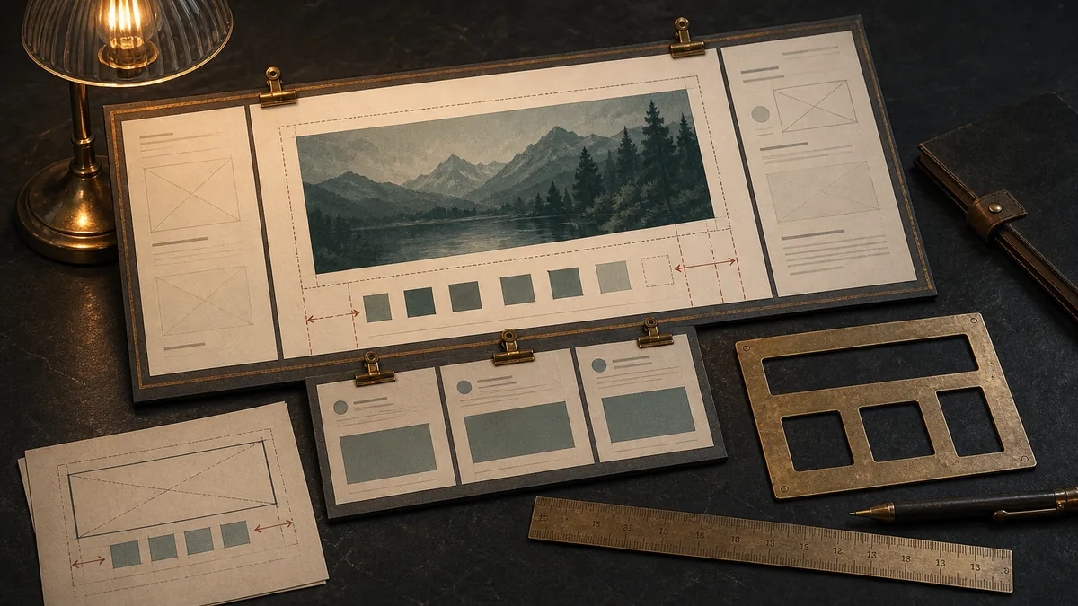
A page can be prepared for an image and still shift when that image loads. The important detail is not only whether the image has a width value, but whether the browser reserved the right aspect ratio for the empty slot. If the placeholder shape and the final image shape do not line up, nearby content such as captions, cards, or buttons can still move when the image appears.
Why the browser's placeholder matters more than the finished image alone
Before an image is fully available, the browser has to make a prediction about how much space to leave in the layout. Modern browsers use width and height attributes to derive a default aspect ratio, and CSS aspect-ratio can also reserve the needed space while the file is loading. That early reservation is what keeps the page from collapsing and expanding around the image.
This is the part that is easy to miss: the final image can be perfectly valid and still nudge the page if its real proportions differ from the ratio the browser reserved at first. In that case, the browser has to reconcile the placeholder with the actual asset after load, and that correction is what causes the visible shift.
Why width alone does not solve the problem
Treating image width as the whole problem misses the vertical side of layout. The browser does not need only a pixel count. It needs enough information to estimate the image footprint before the pixels arrive. Without that, the empty space can start out too small or shaped incorrectly, which makes later adjustment more likely.
That is why a responsive image can look correct on its own and still be disruptive in context. The image may fit the screen once it loads, but the page has already had to make room for it in advance. If that room was guessed with the wrong ratio, the surrounding layout may still shift even though the image itself is not oversized or delayed.
What a mismatch looks like in practice
When the reserved ratio is wrong, the image does not simply appear in a vacuum. It pushes against whatever follows it in the document flow. That is why captions, product cards, and action buttons are often the pieces readers notice moving. The image loads, the browser updates the box, and anything below it gets nudged to a new position.
The key debugging question is not only whether the image eventually displays at the correct size, but whether the browser predicted the same shape that the loaded asset actually uses. If those shapes differ, the page can still feel unstable even though the image file is present and the dimensions were set.
A worked hypothetical example of the failure mode
Hypothetical example: a gallery tile on a product page reserves a tall portrait slot for an image because the markup expects a portrait-shaped frame. On a wider screen, the same asset is served in a wide crop. The image itself is not late and not oversized, but the caption below still shifts because the browser first reserved one shape and then had to adjust to another. If the page had reserved the wide ratio from the start, the caption would have had less reason to move.
How to think about the fix
- Use width and height, or reserve space with CSS aspect-ratio, so the browser can allocate room before the image loads.
- Check the reserved ratio against the real asset or the responsive crop you expect to serve.
- If content still jumps, inspect the placeholder math, not only the pixel width or the image file itself.
The useful mental model is simple: layout stability comes from the browser knowing the right shape early. A correct width can help, but it is not enough by itself if the reserved ratio is wrong. The reason nearby content moves is usually not that the image is bad, but that the page guessed the wrong footprint for it before the pixels arrived.
Your reaction
Loading reactions…
Comments 0
Review comments